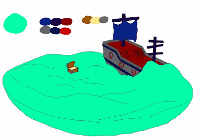
Here is a rough colour palette design for my fishbowl scene, I have tried out some very different colour palettes to get an idea of how I wanted the scene to look. As I need the audience to believe that the rig is in the ocean, I decided to stay away from the flamboyant and bold colours that you would tend to find in a childs' ornamental fishbowl like in the first and third designs. I have chosen the second design to base my textures and colours on, adding a bump map to the ship and treasure chest will make the ship seem like it has been underwater for a long time while also giving it an almost plastic feel.


No comments:
Post a Comment