
Sunday 24 February 2013
Animation Development 1
Wednesday 20 February 2013


Updated House Front

Like the parents scene I have updated this background image, by taking out the harsh dark green shades and replaced then with a slightly lighter purple colour.
Updated Parents Scene

I have made a few alterations to the parents background scene for my animation. Instead of block, colour shading the trees with a dark green which I found to hide the black line detail, I changed it to a dark shade of purple. I believe this works a lot better now because it shows off the black lines and then blends in well with the yellow and green tones of this scene.
Tuesday 19 February 2013


Monday 18 February 2013

Sunday 17 February 2013
New End Scene


New House Front Design

Sunday 10 February 2013
Finished Parents Scene

Parents Scene 6

I found that adding in shadows and highlights to the grass gave it a slightly more realistic feel, also the line work on the patio doors made them look as if they were slightly extruded from the house. This background scene was very challenging compared to the rest of the scenes that I have designed, seeing as there will be very little animation in this scene I have designed the whole of the background in Photoshop. I will layer the design of the parents on the background once I have finished them, this will then complete the parents scene of my animation. I will then animate the rest on the scene in After effects, this will include the water in the pool and perhaps a bird flying in the background.
Parents Scene 5

I found that I had quite a few problems creating the grass for this scene, it was difficult getting it to look realistic.


Parents Scene 1

This is the start of my parents scene for my final animation, this will be a quick scene that will cut from the hectic cross section to show the parents relaxing in the sun outside.
Friday 8 February 2013
.JPG)
Wednesday 6 February 2013
Boys Bedroom Scene 2 Finished

My finished design for my characters bedroom. Again I have added a surface blur to slightly fade out the background, to create a softer surface for the characters to stand against.


Boys Bedroom Scene 2 - 1

Starting the design for another background for my animation, I scanned in a scene from my storyboard to give myself a better guide to show the proportions of the objects in the room compared to the characters scale. This scene will take place in the boys bedroom, from this perspective the window will be behind the camera so everything will have a strong light source. Like the previous background scenes, I have started with by quick painting walls to help me figure out where the direction of light will be.
Boy Bedroom Design Finished

Finished bedroom design, once all the furniture was in place I added in a surface blur so that once I animate the characters on top it will not steal focus from the storyline.

Boy Bedroom Design 1
The starting design for my main characters bedroom. I did a quick paint for the walls to get an even gradual tone. I stuck to my storyboard scene design to make it easier.
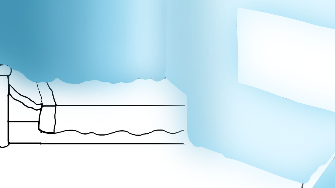
House Cross Section Finished Design

This is my finished cross section design, this will be used in the scene when the Imp is racing around destroying the house. I will have the camera pan out of the boys bedroom once the Imp comes to life, I will then be able to see the Imp throwing the furniture around, while the boy is trying to capture him. This will allow me to get as much action as I can into a 20 second time period. I feel that the simplicity of the house cross section wont distract the audience from the character action, but the subtle use of tone gives a three dimensional effect to the environment, I wanted to give each room its own colour scheme to show a variety of tonal highlights. Overall I really like the defined edges given to the furniture and house outline, it shows more detail to the finished piece.
Tuesday 5 February 2013

Animatic 2

This version of my Animatic has changed slightly from my original upload, I have added in some zoom shots to make the piece more interesting rather than having the audience looking at a flat animation. Zooming in on the face and in the window of the house in the introduction gives further guidance to the audience so they know where to look and also where the story takes place. I am going to add a cross fade from the intro of the window to the boy standing in his room holding the potion bottle up in the air, just to make it seem like the camera is going through the window into the house. I feel like this will add a new dimension to an animation which has been time restricted to 20 seconds.
Sunday 3 February 2013
House Front Blurred

While playing around with the idea of a blurred background concept for the individual rooms in my animation, I wanted to see how the introduction to my animation would look slightly blurred as well. I found that the original design seemed far too harsh compared with the rest of the background scenes, and I like how this image looks now and I feel that it wont now look out of place.
Final Scene Background - Finished

This is my finished scene for my animation, I have blurred out the background to make the characters seem more prominent. Overall I am happy with how it turned out, I will add in the boy once I upload this image into either Flash or After Effects. This drawing was difficult to do in Photoshop because I wanted to make sure that the room and the objects within it lined up properly, there was a problem with the shading but when the blur was added it seemed to fix the intensity of the shadow.


Final Scene Background - Room Development 1

Here I began developing the living room, this is where the parents will discover their son in the destroyed house after defeating the Imp. For the perspective of the parents compared to the room, I wanted the parents to be higher than the boy to show a superiority.


Subscribe to:
Posts (Atom)